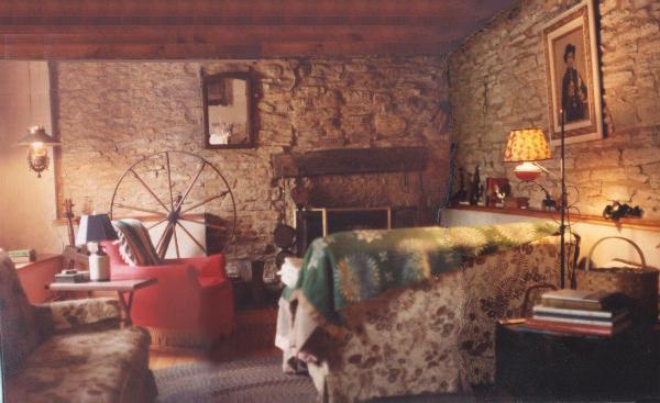
An 1830's House of Stone & Logs
Sometimes the goal in decorating is to look like you didn't do anything.
This room is like that. When I first saw this room, the plaster walls were painted shiny white to "enlarge the
room." Instead, all the white paint did was make the original materials look dirty, which, of course, they
are. That's historic soot. To bring the newer plaster walls into harmony with the rest of the room, I sponged them
to match the aged stone. The room instantly felt right. I also replaced the white shades on the lamps for the same
reason--too much contrast. Now, Great-Grandad's original Victorian frame, which looked dingy next to the white, stands
out as the brightest thing in the room. If he were to step put of his frame, I hope he'd feel right at home.
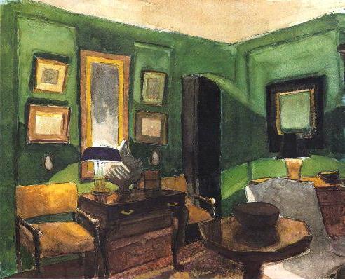
Trying a New Color
You can get in trouble by choosing a paint color based on how it looks
on TV, or in a photo. After you're done, you can't believe it's the same color. Painting samples on the wall
is the easiest way to avoid this problem. When I switched my living room from oyster to olive, it took 13 tries
before I got the right shade. At least I didn't have to buy all that paint. There was a blizzard going on
and I couldn't get out, so I mixed it by hand, a cup at a time. When I got a color I liked, I had the paint
store match my sample. The kid who mixed it kept saying "That's not right." He knew blue and yellow make
green, but the scanner said to use black and yellow. Of course, the machine was right. My sample was olive, not
green, and a true olive has no blue in it. Another thing I do before I begin is to paint a watercolor, to make
sure I'll like the look of the finished room. It's a good thing I do. My plan had been to use an
Empire green, but I soon realized it was way too intense. It's lots easier to switch gears at this point than when
you're almost finished.
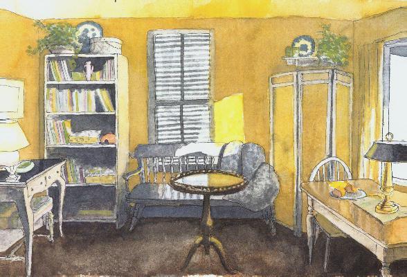
A Temporary Retreat
Some color associations are culturally based. In the Western
world, white evokes youth and purity, but in many Asian lands, it is the color of death. In some countries, brides
marry in black. Other responses to color are physiological. Baker-Miller pink (bubble gum
pink to most of us) is an example of a color with a measurable effect in calming violent persons. Color also
has psychological value. White was once considered good for hospital rooms but long-term patients suffered sensory
deprivation from the boring environment. This
room in a newly-rented house was put together in four days for a small family with a sick child who needed a quiet, private place
to rest on the occasions when he was allowed a few hours outside of the hospital grounds. Familiar
furniture and books, cheerful colors, and big windows to watch the neighborhood helped to give temporary quarters the
feeling of home, even if only for a few hours.
|